
Looking forward to a brighter future… after Living Coral in 2019 and Classic Blue in 2020, PANTONE® introduces Ultimate Gray + Illuminating Yellow into the mix for 2021, perfect to create a happy home!
2021 PANTONE® Colour of the Year is described as ‘A marriage of colour conveying a message of strength and hopefulness that is both enduring and uplifting’.

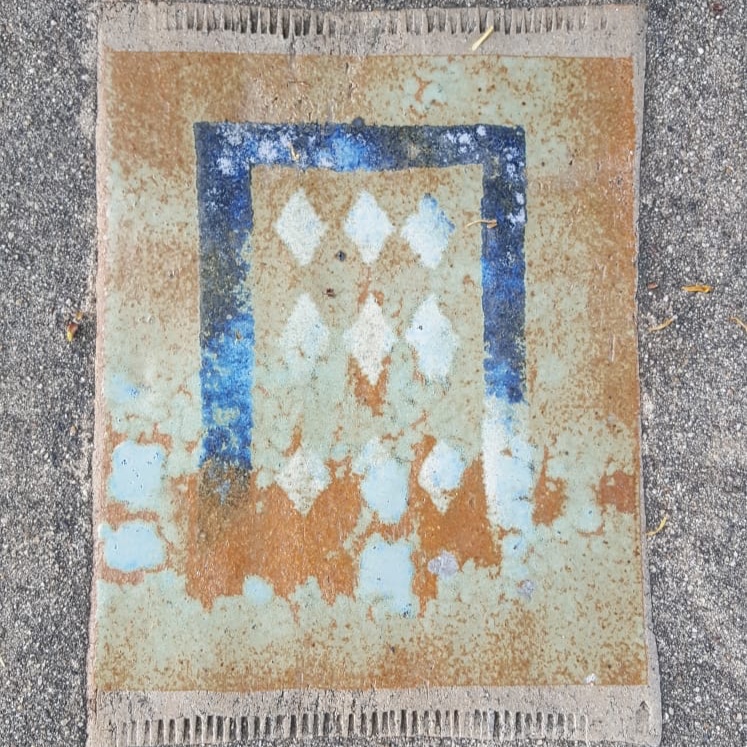
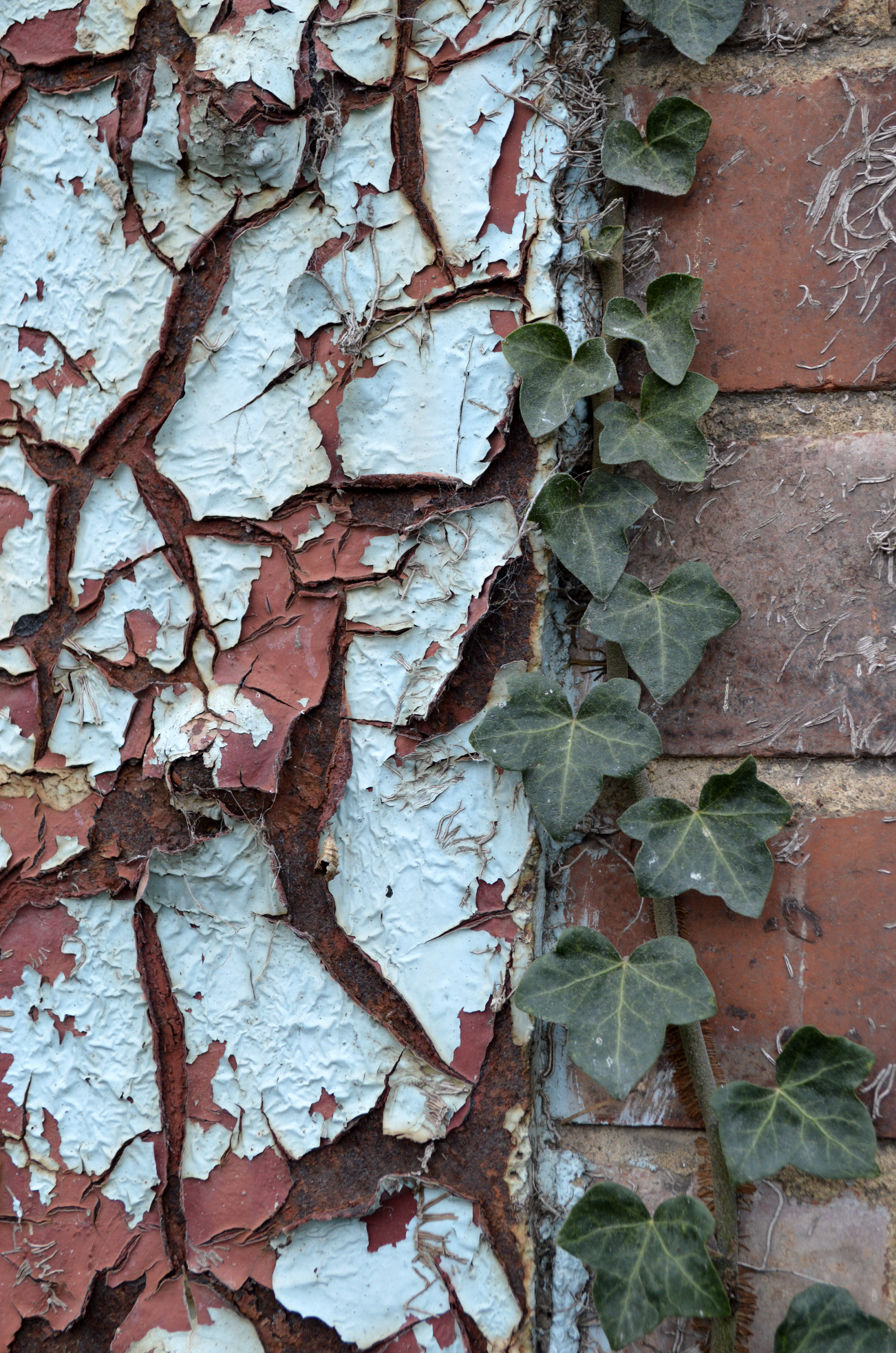
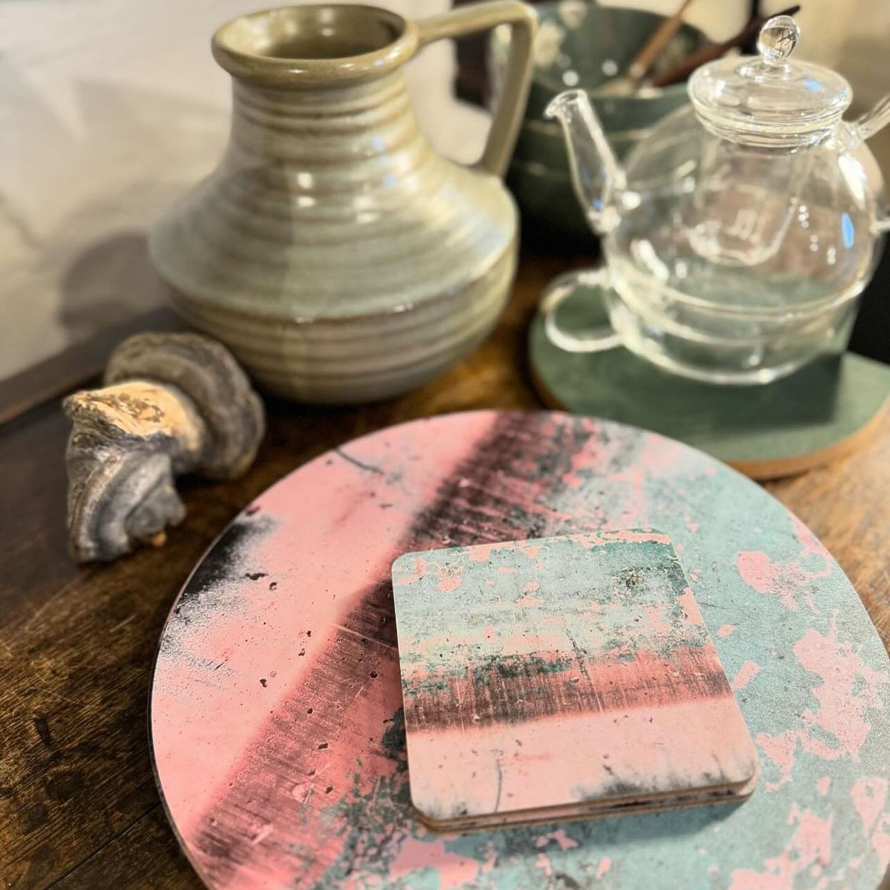
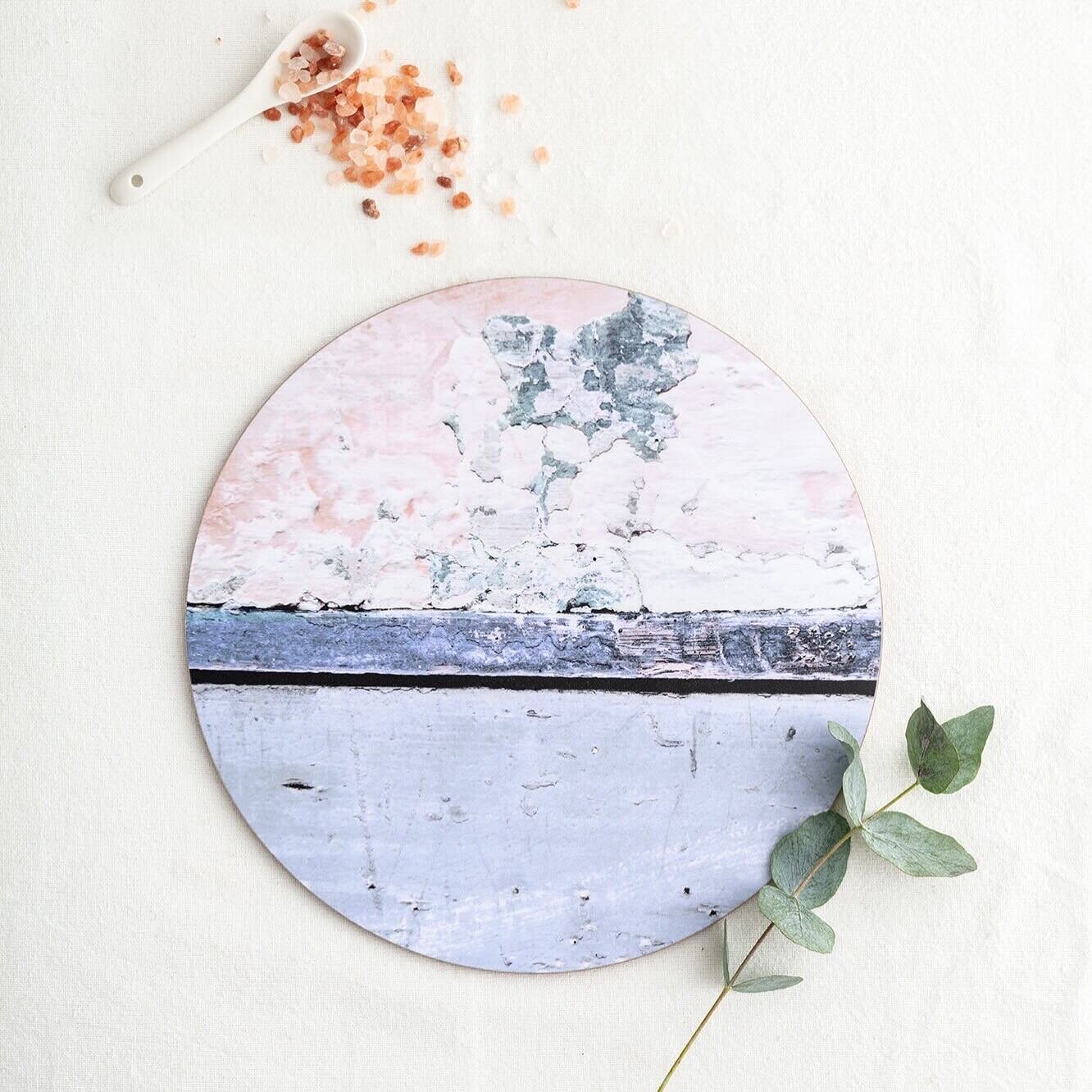
Soft Grey and Yellow Ochre abstract wall art print - 'Nomad Splash Eclipse' - from £25
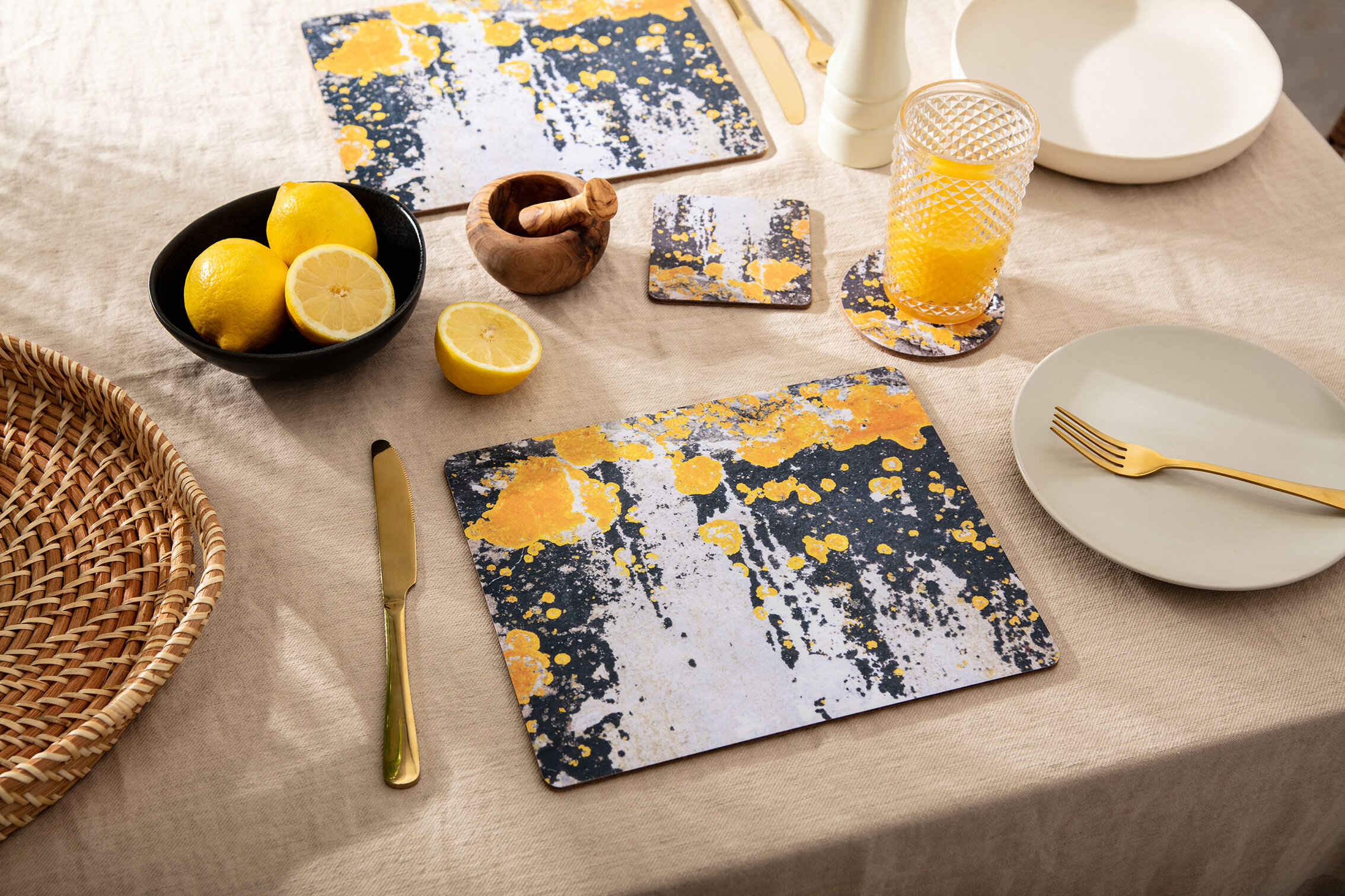
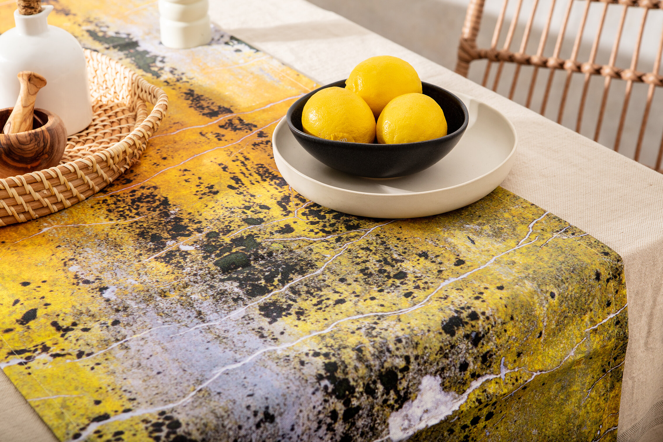
Practical and rock solid but at the same time warming and optimistic, the union of PANTONE 17-5104 Ultimate Gray + PANTONE 13-0647 Illuminating is one of strength and positivity. It is a story of colour that encapsulates deeper feelings of thoughtfulness with the promise of something sunny and friendly.
These tones can be found in our very own Nomad collection, active designs evoking travel nostalgia, holiday happiness and inspiring creativity.